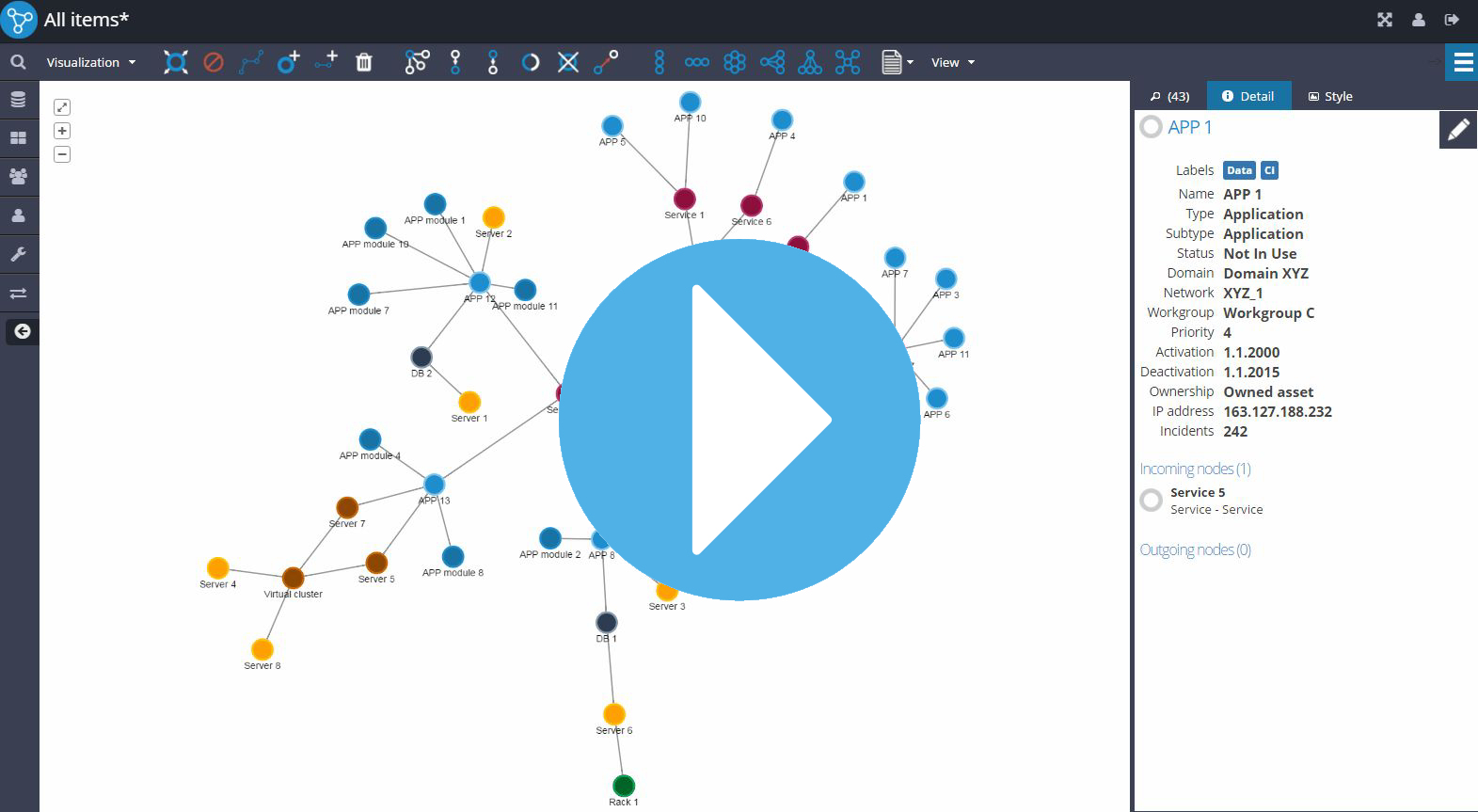
Loading...

Visualization

Powerful HTML5 based graph visualizations with cytoscape.js library works with every major browser and platform

Graph DB

Graphlytic supports the world's leading graph database Neo4j which enables us to give you fantastic performance

Analytics

Look for patterns in your data with easy to use layouts, filtering or mapping data to visual properties like color or size

Scheduled Jobs

With Jobs it's easy to write and schedule your own scripts for importing data, searching patterns (with Cypher or Gremlin), and sending emails

Collaboration

Data analysis doesn't have to be a lonely job. Collaborate with other users and share your findings or export images and data

Business Solutions

Contact us if you are interested in using Graphlytic in specific business cases. We are happy to help you with the setup

Feature Clips

Select some interesting category and learn new features in few minutes

Graph Exploring

Visualization
Graph exploring is one of the key features of Graphlytic. Let's start with a fulltext search to add a few elements. Additional filtering conditions can be combined with the fulltext search to find exactly what you want.
You can expand the nodes by double-clicking or using the Expand option of the context menu. The advanced filtering options allow detailed filtering of the results before any data is loaded from the graph database. After adding the condition for node or relationship data, select which relationship groups you want to add to the visualization.
The layout options can be used to reposition the selected nodes in commonly used patterns like tree, grid, circular, or force-directed simulation. This is particularly helpful when the visualization becomes larger.
The selected graph part can be rotated by holding down the right mouse button and moving the mouse in the desired direction.
To hide some nodes, select them and click the hide button in the toolbox or use the hide option in the context menu.
Frequency charts in the statistics panel are a powerful way to select elements based on their data. Clicking on any property value will select or unselect all elements with that value. It also works the other way around; selecting part of the graph will select appropriate frequency chart parts.
The Detail tab shows detailed information stored on the selected node or relationship.
If you want to select elements based on their relationships, use the selection buttons. You can also choose the direction of selection propagation or implement your own selection logic as a custom widget.
Select two nodes in the visualization and click the shortest path button in the toolbox to search for connections between nodes. Filtering options can improve the algorithm's performance. The shortest paths are calculated in the database and presented in a preview window. After confirmation, new nodes and relationships are added to the visualization, and the chosen paths are selected.

Shortest Path

Visualization
To find all shortest paths between two nodes in a graph simply select these two nodes and press the "Find the shortest path" button. All shortest paths are calculated and the user can choose which paths to add to the visualization. The paths are calculated using all data in the graph database.
View the different paths using the tabs on the left. Usually, some of the paths are similar in the sense that they have the same type of entities along the path. These paths can be grouped together using the "Group similar paths" checkbox to easily select or unselect whole groups.
Separate paths or groups can be selected or unselected. Selected paths are combined in the "Selected paths" tab. This is the resulting subgraph that will be added to the visualization. If all elements of the selected paths are already in the visualization then the layout of the existing elements is preserved, paths are selected and centered.

Selections

Visualization
With the selections buttons in the toolbox and statistics charts, it's really easy to select parts of the graph based on various conditions. Just select a starting point, click on the "select neighbors" button. Notice how the statistics charts automatically show the portion of selected elements across different properties. The selection buttons can be used repeatedly to add additional layers of connected nodes to the group of selected elements.
To select or unselect elements with a particular property, just click on the value in the property statistics chart. For example, to see all virtual servers managed by all virtual managers in our dataset, start with clicking on the virtual manager property in the chart, and then select all incoming nodes.
To check what types of relationships are connecting the servers and managers in this example, go to the relationship tab. To select or unselect relationships based on their properties just click on the values.
Selections can be used with multiple starting points, simply select some nodes and use one of the selection buttons.
Inverting the selection allows selecting even more complicated patterns.
Custom selection rules can be easily plugged into the visualization using our widgets. One of the widgets, called Outage Propagation, can be used to simulate how a potential outage might spread across a network. Configuration of the widget allows specifying how many underlying nodes have to be down in order to propagate the outage to parent nodes. In our example all three nodes have to be down to propagate the outage, depicting a redundancy in the infrastructure.

Style Mapping

Visualization
With Discrete Mapping you can set style values of any element in the graph visualization based on discrete mapping rules for each data value stored in a data property (either virtual or database property), e.g. "Rack" is blue, "Server" is green, etc.
  • To create any Mapper (linear or discrete) open the Mapper Editor associated with any visual property (like background color or size of nodes, relationships' width or color, etc.), select which property's values should be used in mapping, and select mapped values.

With Linear Mapping you can set style properties like color or dimensions of nodes and relationships of the graph visualization continuously based on numeric data (metrics) stored in any data property (either virtual or database property)
  • To create any Mapper (linear or discrete) open the Mapper Editor associated with any visual property (like background color or size of nodes, relationships' width or color, etc.), select which property's values should be used in the mapping (so-called data property) and select mapped values.
  • Linear Mapping is defined with two reference points which are used to calculate style values for elements using linear interpolation. These points can be set manually or you can use the "Auto" threshold which will automatically use the maximum and minimum from current data in the graph visualization.
  • When you set the thresholds manually (one of them or both) then every data value below the minimum is mapped to style value associated with the minimum threshold and every data value above the maximum is mapped to style value associated with a maximum threshold.

Import Data From a File

Import/Export
Quick import of graph elements from a CSV or Microsoft Excel file can be done on the Search page or directly in the visualization with the "Import file" button.
To import the file simply drag&drop it in the Import window. Select if you want to import nodes or relationships. Choose the Excel tab from which data will be imported (in case of a CSV file choose the column delimiter). Select if you want to use the names of properties from the file header. You can give your import an Import ID, this value will be stored on every imported element to allow easy lookup of the elements after the import is complete. Choose how the node labels will be created. Set the unique property, this will ensure that if there already are nodes with the same unique property in the database these nodes will be merged with the imported data instead of duplicating the nodes.
After a successful import, the next steps can be chosen, like creating a saved query for later lookup of the imported elements, visualizing the imported elements, or starting a new import with the same import ID.
Importing relationships is very similar to the additional step of matching the start and end node of the relationships using a unique identifier in your data.

Statistics

Visualization
The statistics panel is located in the right info panel in the visualization.
The overall number of elements in the graph and the number of selected elements can be found in the header of the panel.Next is the part with the statistics charts divided into nodes and relationships.
Chart for every property, database or virtual, can be added into the panel to uncover patterns in the data.
Select an element in the graph and the corresponding charts will be updated based on the property values of the selected element.
It works also the other way around. By clicking on any chart value all elements with that value will be selected. The charts will be updated based on all property values of the selected elements to maintain consistency between the selection state in the charts and in the graph.
Charts can be collapsed or rearranged to allow visual detection of similarities between different properties. For instance, to analyze the number of incidents for different types of network profiles, the charts "profile" and "incidents" can be put closer together to instantly see the selection changes without any scrolling.
When there's an exponential or a heavy-tailed distribution, the logarithmic scale can be used to make the smaller values more readable.
In combination with the selection tools, it's easy to uncover the types of network components and their incident rates for the supporting infrastructure of a particular graph element.The same techniques can be also applied to relationships' data.
A new chart for any property can be added with the "Add property chart" button. Unwanted charts can be hidden with the "Hide" option in the chart's menu.

Export

VisualizationImport/Export
Visualization can be exported as an image or a data file using the export menu. To export data in a format that can be opened in any spreadsheet editor like MS Excel, choose the CSV option from the Export menu.
Choose which properties should be exported and rearrange them to change the order of the columns in the exported CSV file.
Choose the sorting property to change the order of the rows in the exported file.
Exporting relationships is very similar to exporting nodes. It has the option to add properties from the nodes connected with the exported relationship.
If a part of the graph is selected then only elements from this part are included in the exported data file.
There is also a special sorting algorithm called "Detect path" that will find the longest path in the exported graph and the rows in the file will be sorted according to the path. All other elements will be placed after the path rows.

Layouts

Visualization
Applying the right layout is crucial for a visual overview of the interdependence between nodes in graph visualization.
  • Layouts are applied to the selected part of the graph visualization or to the whole graph if nothing is selected.
  • Use mouse and keyboard shortcuts to quickly organize the graph
    • CTRL(⌘) + A : select all elements in the graph visualization
    • CTRL(⌘) + F : open the search tab in the graph visualization and set focus on the search field so you can start typing search string right away
    • CTRL(⌘) + S : save the visualization
    • CTRL(⌘) + UP_ARROW : horizontal ALIGNMENT of selected nodes
    • CTRL(⌘) + LEFT_ARROW : vertical ALIGNMENT of selected nodes
    • CTRL(⌘) + RIGHT_ARROW : equal horizontal SPACING between selected nodes
    • CTRL(⌘) + DOWN_ARROW : equal vertical SPACING between selected nodes
    • CTRL(⌘) + MOUSE_WHEEL : expand or reduce the spacing between selected nodes
    • ARROWS : move selected part of the graph in the desired direction in the graph visualization

Virtual Properties

Visualization
There are two types of properties you can use in graph visualization. The first are properties stored in Neo4j which we call Database properties. The other ones are Virtual properties which exist only in the scope of graph visualization and represent small JavaScript calculations used for searching for patterns or creating some sort of logic on top of data stored in the database.
  • To create a Virtual property go to the Detail tab and click on "Add virtual property" > "Create new property". When you are on the detail of a node then you are creating a Virtual property for nodes and when you are on the detail of a relationship then you are creating a Virtual property for relationships.
  • In the edit window create your JavaScript formula which returns some value. You can use the predefined templates for inspiration and test your formula with the "Test formula" button.
  • Formulas defined in Virtual properties are calculated for every node in the graph visualization and the result is listed in the Detail tab.
  • Virtual properties can be used in the Statistics tab for selecting or in Style mappers for styling the graph visualization.

Details tab

Visualization
Details about the selected node or relationship can be viewed on the Detail tab in the graph visualization. When multiple elements are selected then details about the first element are displayed.
  • On the top is the element's identification. If a node is selected then the node's title is also shown and the node's labels can be edited with the pencil icon.
  • Next are the Virtual properties of the selected node. It's possible to create and edit locally defined virtual properties or hide/show any virtual property.
  • Database properties: these are the properties stored in the graph database for the selected elements. Database properties can be edited or simply hidden from the tab (you can show them anytime with the Add database property menu).
  • Incoming nodes: here are listed all nodes from the selected node's neighborhood that have a relationship directed from the listed node to the selected node.
  • Outgoing nodes: here are listed all nodes from the selected node's neighborhood that have a relationship directed from the selected node to the listed node.
  • Incoming and outgoing nodes can be easily selected in the graph visualization with the circle icon.
  • It's possible to directly show details of incoming or outgoing nodes (to traverse in the graph visualization) by clicking on the node's snippet.

Search tab

SearchVisualization
When you need to search for a particular node or filter out a set of nodes based on their data you can use the Search tab in the graph visualization.
  • Search directly in data using the search box. The search looks into properties defined on the Settings tab in the Title and Snippets controls.
  • Use the Advanced filter to filter out nodes using multiple filtering criteria. There is a logical OR between values selected in one property and a logical AND between properties. This is helpful for filtering out nodes from the graph visualization based on categories of data. Please note that only properties defined in Data Schema with dataRole set to "dimension" are available in the Advanced filter.
  • Use the Select or Unselect buttons to quickly add or remove currently filtered out nodes from/to selected nodes.
  • Select or unselect nodes in the graph visualization by clicking on the icon of the node snippet in the list or look into details of a node by clicking on the node snippet itself.

Users and Groups

Management
For managing users and groups in the system go either to the Users page or Groups page.
  • To create a new user go to the Users page, click on the Create new user button, fill out mandatory fields, and click Create. You can also choose if the user is Enabled right after creating or if the should be disabled for now.
  • User action buttons: with the management buttons you can enable or disable a user's access to the system, modify the user's name, change password, add or remove a user to or from a group or delete the user.
  • To create a new group of users go to the Groups page, click on the Create group button, fill out mandatory fields, and click create. Here you can also set the group's application permissions which determines what can a member of this group does in the system. Please read more about the permissions in the documentation.
  • Group action buttons: with the management buttons you can edit a group's name, description, or permissions, assign users to the group or delete the group.
Do you want to see the application yourself?
Try Online Demo